Rome Travel Guide

Rome Architecture, History, Art, Museums, Galleries, Fashion, Music, Photos, Walking and Hiking Itineraries, Neighborhoods, News and Social Commentary, Politics, Things to Do in Rome and Environs. Over 900 posts

Showing posts with label modern art. Show all posts

Thursday, July 10, 2025

Homage to Italian Sculptor Arnaldo Pomodoro


Bill in front of the 'opening' piece, Le Battaglie ("The Battles" 1995), which Pomodoro says was inspired by Paolo Uccello's "La Battaglia di San Romano" ("The Battle of San Romano" - first half of 1400s) in Siena. (Hisham Matar's "A Month in Siena" has many incisive pages devoted to this painting.)

Italian sculptor Arnaldo Pomodoro died a little over 2 weeks ago, June 22, the day before his 99th birthday. His works are prominently featured in Rome, including his "smooth-skinned orb slashed to reveal a complex core"--to borrow from the New York Times obit here in front of the Farnesina (the Italian Department of State/Foreign Affairs). To mark his passing from his extraordinarily fruitful life - to the end - we are reprinting here our June 2023 review of an extensive and educational (for us) exhibit of his works in the Fendi-restored Palazzo della Civilta' Romano in EUR.

******************

A little late to the game, we "discovered" Arnaldo Pomodoro, thanks to a newspaper ad on the opening of a new exhibition of some of his large-scale works at Fendi's gallery at the restored Palazzo della Civilta' Romano in EUR. It's not that we hadn't seen his work before - we have long appreciated the globe/sphere in front of the Farnesina, the Italian "state department" in Rome. His "sphere within a sphere" are all over the world, we now know.

The exhibition at Fendi  - Il Grande Teatro delle Civilta' - "The Great Theater of Civilizations" - is remarkable for its installation of numerous enormous works - on the scale of Richard Serra's (though Pomodoro's are one-sided - one cannot walk in and around them).

The Palazzo (also known as the "Square Coliseum") is itself so imposing that at first we found Pomodoro's works installed outside of it simply too small and squatty.


Case in point, right.  Dianne tries to figure out what it is - against the backdrop of a much more imposing statue from the building's original design. Turns out it's Agamemnon, and the design was for a Greek theater production in 2014 in Siracusa and so, makes sense. It wasn't designed for this place.


Two aspects of the exhibit appealed to us. First, the delight of children grooving to the artwork, as at left.

Second, the excellent and informative flat material that gives shape to Pomodoro's lengthy career. He's about to turn 97 (the English language Wikipedia entry says his active years WERE 1954-2005 - whoops!). These are displayed in bright, large glass cases, slide-out drawers - both vertical and horizontal. We were intrigued by his work in the graphics medium.


And we learned about the placement of his works around the world. Newspaper articles and drawings showed that one of his obelisk-type sculptures had been installed on the Gianicolo, in a highly visible but unlikely spot - the traffic circle on the way up to the Bambino Gesu' Hospital that hosts the large entrances to the bus parking for the hordes visiting St. Peter's and the Vatican (you can also access the Caput Mundi shopping mall Bill wrote about recently from this underground parking venue). Below is the sketch - but it must have been there because there also were photos of it being installed. We missed it "in the flesh."


Left, Dianne checking out one of the drawers with sketches, newspaper articles, graphic works, and explanations. (If only my kitchen drawers worked this well!)


A hand-out at the exhibition shows the location of Pomodoro's works around Rome. We later were on a tour of Palazzo dello Sport (Nervi's ground-breaking building for the 1960 Olympics; Ali - as Cassius Clay - won his gold medal here), which features a Pomodoro obelisk in another once-traffic-circle (named Piazzale Pier Luigi Nervi), now abandoned and rather forlorn.
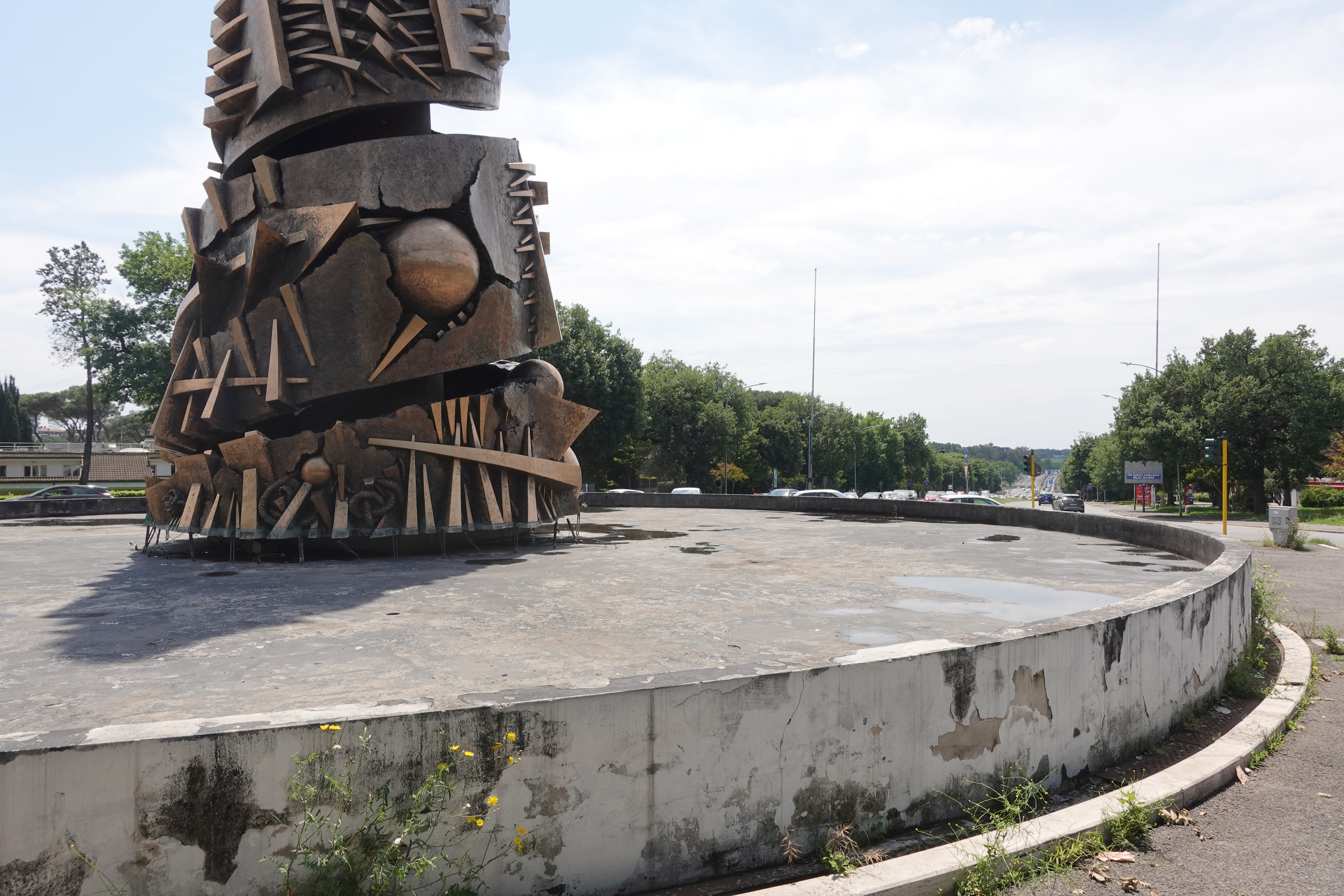

The photo at right shows the condition of the piazza and statue.

We've heard the complaint (and are tempted ourselves) to view Pomodoro as a "one-trick pony." If you unwrap the obelisk, it looks like the flat pieces. The shapes are similar throughout his work. 

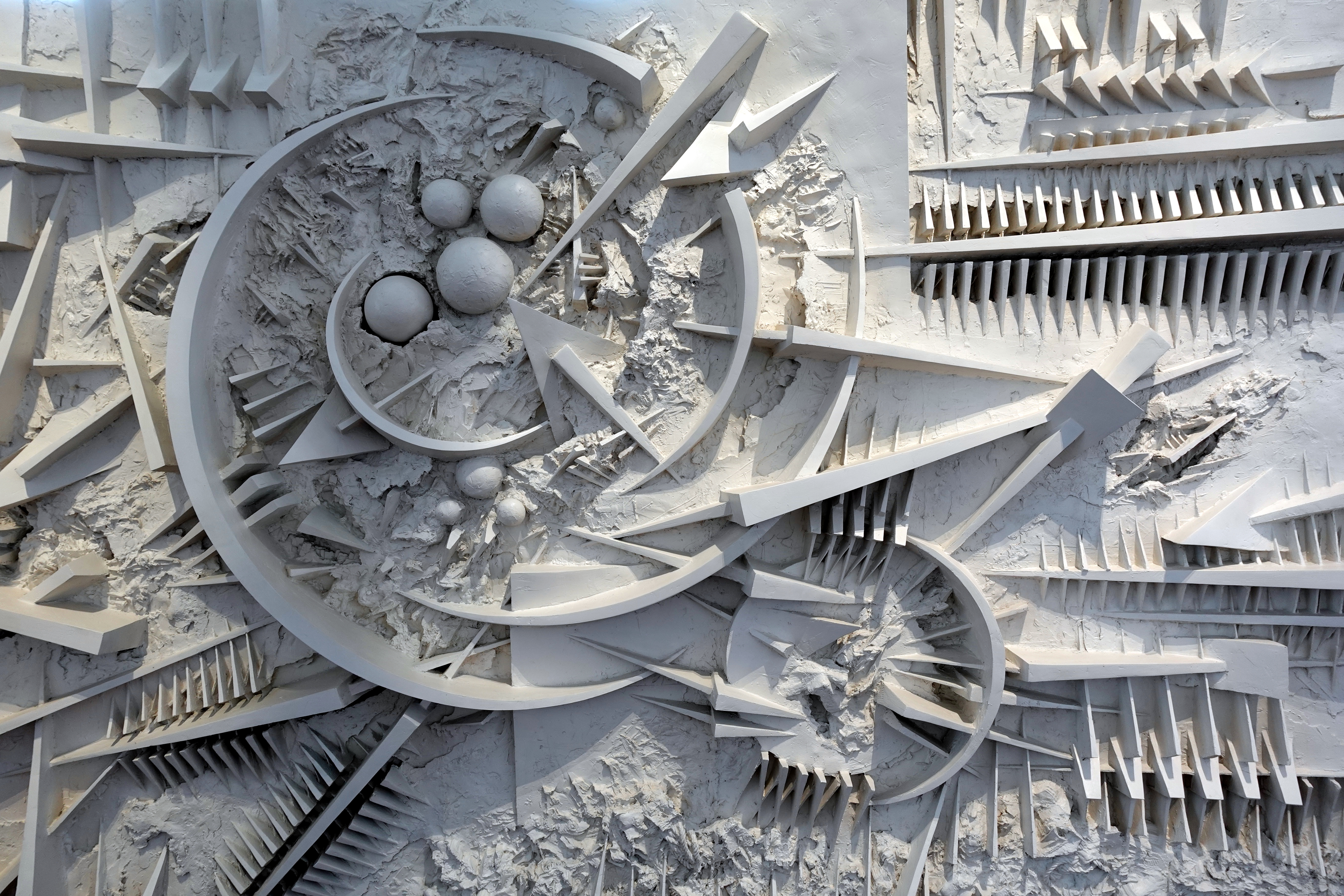
The exhibition at Fendi ends with a newer piece (1996-97, below) that is a complement in white to the introductory Le Battaglie that leads off this post.

To us, it didn't seem to move the needle much in terms of his art. 

The title of the work is Movimento in pieno aria e nel profondo ("Movement in free space and in the depths" - or something like that!).


Close-up at right.

On the other hand, if one looks at his costumes, graphic work, public art - the way it is placed in the world, his vision seems greater.  

We close with some of these other pieces, including our having fun with them - which is a benefit of art as well.


If you can't get to Rome to see Il Grande Teatro delle Civilta' - "The Great Theater of Civilizations" before it closes October 1, the website is comprehensive. It includes all the works, plus a visual tour, plus a map of his works all over the world.

In Italian and English here: https://arnaldopomodoro.fendi.com/en/

Dianne


RST with one of the costumes, this one from 1986 for Didone (Dido), one of my favorite tragic heroines. .


There's a relationship between the faux "printer's wheel" outside (Rotativa di Babilonia - Babylon's wheel, 1991) and the graphics-type work inside (Tracce I-VII - Traces 1-7, 1998) (above and below).


A close-up of Il cubo ("The Cube," 1961-62), one of the first works in the show, and one one of us found intriguing - maybe because it had some "white space" in it.


Below is the most recent of Pomodoro's sculptures in the exhibition - Continuum, 2010 - one that seems to highlight made-up hieroglyphics. Pomodoro's large, rectangular pieces remind us of Richard Serra's, but the Italian sculptor's are very much 2-dimensional with bas relief, not the 3-dimensional, run-around-and-through-it of Serra.


The artist with his barbed take on Fendi's Peekaboo bag - on display during the exhibition: 

(Image credit: Carlos & Dario Tettamanzi)

Monday, June 26, 2023

Sculptor Arnaldo Pomodoro and Fendi Put On a Show

Bill in front of the 'opening' piece, Le Battaglie ("The Battles" 1995), which Pomodoro says was inspired by Paolo Uccello's "La Battaglia di San Romano" ("The Battle of San Romano" - first half of 1400s) in Siena. (Hisham Matar's "A Month in Siena" has many incisive pages devoted to this painting.)

A little late to the game, we "discovered" Arnaldo Pomodoro, thanks to a newspaper ad on the opening of a new exhibition of some of his large-scale works at Fendi's gallery at the restored Palazzo della Civilta' Romano in EUR. It's not that we hadn't seen his work before - we have long appreciated the globe/sphere in front of the Farnesina, the Italian "state department" in Rome. His "sphere within a sphere" are all over the world, we now know.

The exhibition at Fendi  - Il Grande Teatro delle Civilta' - "The Great Theater of Civilizations" - is remarkable for its installation of numerous enormous works - on the scale of Richard Serra's (though Pomodoro's are one-sided - one cannot walk in and around them).

The Palazzo (also known as the "Square Coliseum") is itself so imposing that at first we found Pomodoro's works installed outside of it simply too small and squatty.


Case in point, right.  Dianne tries to figure out what it is - against the backdrop of a much more imposing statue from the building's original design. Turns out it's Agamemnon, and the design was for a Greek theater production in 2014 in Siracusa and so, makes sense. It wasn't designed for this place.


Two aspects of the exhibit appealed to us. First, the delight of children grooving to the artwork, as at left.

Second, the excellent and informative flat material that gives shape to Pomodoro's lengthy career. He's about to turn 97 (the English language Wikipedia entry says his active years WERE 1954-2005 - whoops!). These are displayed in bright, large glass cases, slide-out drawers - both vertical and horizontal. We were intrigued by his work in the graphics medium.


And we learned about the placement of his works around the world. Newspaper articles and drawings showed that one of his obelisk-type sculptures had been installed on the Gianicolo, in a highly visible but unlikely spot - the traffic circle on the way up to the Bambino Gesu' Hospital that hosts the large entrances to the bus parking for the hordes visiting St. Peter's and the Vatican (you can also access the Caput Mundi shopping mall Bill wrote about recently from this underground parking venue). Below is the sketch - but it must have been there because there also were photos of it being installed. We missed it "in the flesh."


Left, Dianne checking out one of the drawers with sketches, newspaper articles, graphic works, and explanations. (If only my kitchen drawers worked this well!)


A hand-out at the exhibition shows the location of Pomodoro's works around Rome. We later were on a tour of Palazzo dello Sport (Nervi's ground-breaking building for the 1960 Olympics; Ali - as Cassius Clay - won his gold medal here), which features a Pomodoro obelisk in another once-traffic-circle (named Piazzale Pier Luigi Nervi), now abandoned and rather forlorn.


The photo at right shows the condition of the piazza and statue.

We've heard the complaint (and are tempted ourselves) to view Pomodoro as a "one-trick pony." If you unwrap the obelisk, it looks like the flat pieces. The shapes are similar throughout his work. 

The exhibition at Fendi ends with a newer piece (1996-97, below) that is a complement in white to the introductory Le Battaglie that leads off this post.

To us, it didn't seem to move the needle much in terms of his art. 

The title of the work is Movimento in pieno aria e nel profondo ("Movement in free space and in the depths" - or something like that!).

Close-up at right.

On the other hand, if one looks at his costumes, graphic work, public art - the way it is placed in the world, his vision seems greater.  

We close with some of these other pieces, including our having fun with them - which is a benefit of art as well.


If you can't get to Rome to see Il Grande Teatro delle Civilta' - "The Great Theater of Civilizations" before it closes October 1, the website is comprehensive. It includes all the works, plus a visual tour, plus a map of his works all over the world.

In Italian and English here: https://arnaldopomodoro.fendi.com/en/

Dianne


RST with one of the costumes, this one from 1986 for Didone (Dido), one of my favorite tragic heroines. .


There's a relationship between the faux "printer's wheel" outside (Rotativa di Babilonia - Babylon's wheel, 1991) and the graphics-type work inside (Tracce I-VII - Traces 1-7, 1998) (above and below).


A close-up of Il cubo ("The Cube," 1961-62), one of the first works in the show, and one one of us found intriguing - maybe because it had some "white space" in it.


Below is the most recent of Pomodoro's sculptures in the exhibition - Continuum, 2010 - one that seems to highlight made-up hieroglyphics. Pomodoro's large, rectangular pieces remind us of Richard Serra's, but the Italian sculptor's are very much 2-dimensional with bas relief, not the 3-dimensional, run-around-and-through-it of Serra.


The artist with his barbed take on Fendi's Peekaboo bag - on display during the exhibition: 

(Image credit: Carlos & Dario Tettamanzi)

Friday, September 6, 2019

Art for Tourists? and is that bad? Three exhibitions in Rome: Gallerias Corsini, Borghese and Nazionale.

Juxtaposing art works by a theme other than historical context seems to be the new-ish rage. A couple Rome examples.

First, the Robert Mapplethorpe exhibition at Galleria Corsini. I'm sure the Popes, cardinals, and royals who established and contributed to this gallery would roll over in their graves had they seen (a bit hard to do from the grave) Robert Mapplethorpe's stunning black and white photographs of sadomasochism next to paintings of saints. That's what the Corsini did - the show has been extended until October 6. I was fascinated by it; Bill not so much.

Then I wondered if I was falling into the trap of simplistic viewing of art - art for tourists rather than art for those who know and appreciate art, to steal a distinction used by Christopher Knight recently in a screed against the new Los Angeles County Museum of Art (LACMA) new building design and curator goals. A nicer way to put it, per Knight, is that "Every art museum serves two publics - an art public and a general public." In his polemic, Knight says LACMA's current plan "puts a thumb on the scale for the latter."

The extension of the Mapplethorpe exhibition was justified, according to the gallery, because public viewing of the Corsini doubled - part way through the current show - compared to the same period last year. In our experience, the Corsini is generally not one of the most visited museums in Rome.

Here's one of the more audacious Mapplethorpe juxtapositions, as I reference above:
Mapplethorpe, Lisa Lyon, 1981. The three paintings are by Bolognese painter
Guido Reni (1575-1642) of Christ with the Crown of Thorns, the Sorrowful Virgin 
and St. John the Baptist. The sculpture is "Silenus Head," Roman, 2nd Century AD.
The curator places the photography of body-builder Lisa Lyon in sadomasochistic garb below the three Guido Reni paintings of pained saints. What is the viewer to think about these works? That depictions of sorrow and pain can have similarities and differences over centuries? That Mapplethorpe's work is rooted in the classical?  It seems to me these are worthy questions, and they don't make the works "homeless," a term Knight uses.

I recall a pamphlet on the exhibition (which I lost on the way back from Rome) that explained Mapplethorpe's deep ties to classical art. And the image below demonstrates that:
Mapplethorpe, "Black Bust" (1988) and "Apollo" (1988), The sculpture is by Luigi Bienalmé
(1795 -1878), "Dancer with Finger on her Chin," in Rome's Galleria Corsini. Another sculpture from the 17th century "framed" Mapplethorpe's photographs on the other side.

Another exhibition illustrating this 'trend' is one I didn't see - Lucio Fontana's work placed in the Galleria Borghese, apparently the first 20th-century artist to be so "honored." It closed August 25. This one, too, keeps the Renaissance works in their own context, and adds Fontana. I'll leave it up to you to decide if the interplay adds meaning (photo below right).
"Terra e Oro" (Earth and Gold), Fontana exhibition at the
Galleria Borghese in Rome.

A third exhibition - on view until November 3 - takes a similar approach.  "Joint Is Out of Time," a follow-on to 2016's "Time Is Out of Joint" (yes, from "Hamlet") uses works in the Galleria Nazionale's collection placed in a context with each other that is not related to their style or chronology,  This is more of the type of exhibition Knight complains about - it takes everything out of context.  Each room in the exhibition has a different theme or way of connecting the pieces in it.

I liked one room that I would call "war" (the Gallery's descriptions of the rooms were non-existent for the most part, and there was very little information about the art work and the artists), even though it takes very different types of works in different media from different periods and puts them together. On the other hand, is this just "art tourism"? Art for the general public?  What more can we say than that the theme is one of fighting? Does the juxtaposition make us understand or appreciate any of the works more than if they were in context with other artists/styles/periods that are similar?

The sculpture of the fighting dogs, which is disturbingly real and well-placed in the gallery, is by Italian sculptor Davide Rivalta. It was in the 2016 exhibition as well. I don't recall the artist of the painting on the wall (one of our readers might). At the Galleria Nazionale d'Arte Moderna in Rome.
Unlike the pamphlet for the Mapplethorpe exhibition, the limited material available for the Galleria Nazionale exhibition was, frankly, close to unintelligible curator high b.s. And there was no attempt to tie the works together in the different rooms of the museum. You were on your own.  Or, if you were like these teenagers at right, in the room on "war," you were bored (whatever was on their phones was more interesting, apparently).

Below is an example from the Mapplethorpe exhibit that seemed to me too simplistic.  Each is a portrait of a dandy, from different periods. Each artist selected a similar profile; each subject has a high forehead and trimmed beard. Should we appreciate the similarities, or are the similarities simply superficial?
Left, Simone Cantarini, "Self-Portrait" (1612-1648);
Right, Mapplethorpe, "Harry Lunn," 1976. Galleria Corsini, Rome.

Another benefit from this type of exhibition is that it uses primarily the works already in the gallery. It doesn't require the loan of an entire show worth of works (in the case of Galleria Nazionale). It doesn't require rehanging an entire gallery (in the case of the Corsini and Borghese museums). In other words, it's economical compared to travelling or entirely new shows, at a time when galleries are underfunded.

Jason Farago, in a recent article in the New York Times on an exhibition at the Pompidou Center entitled “Préhistoire” ("Prehistory"), made a similar distinction in reviewing a show he says demonstrates - in detail - how "prehistory" influenced modern artists. He states, "This show doesn’t merely juxtapose hand axes and fossils with superficially concordant modern art, but grounds these juxtapositions with the artists’ notebooks, interviews, and other primary sources."  He is critical of some works in the show, noting "the curators' engagement with modernity and thickened time gives way to a few too many wink-nudge sendups of old rocks and fertility goddesses."  It's these "wink-nudge" comparisons that trouble me.

A contrast to the Rome exhibitions highlighted above is the Galleria Moderna d'Arte's (the city of  Rome's modern art gallery - once the Mussolini gallery (!)),exhibition on the depiction of women in art in the 20th century (a specific theme, a chronological approach, but also using its own collection) and the Palazzo Merulana (the private gallery about which I wrote a year ago) exhibition on the works of Giacomo Balla - a specific artist, again of the 20th century. (Photos below.) More traditional shows, not likely to draw as many visitors perhaps, but, to me, giving the viewer more opportunity to learn about the art.

Balla, "Autocaffè" 1928, in the show:
"Giacomo Balla. Dal Futurismo astratto
 al Futurismo iconico" (Giacomo Balla:
 From abstract Futurism to iconic Futurism)
 at Palazzo Merulana.
Photograph in Rome's Galleria Moderna d'Arte from its
show "Donne. Corpo e immagine tra simbolo e rivoluzione"
 ("Women: Body and image in symbol and revolution").


A respected gallery curator with whom I was speaking recently (who knew the three shows I highlighted above only from my descriptions) said these types of placement of works could encourage people who have previously seen the works to look at them in new ways, or could cause viewers who don't normally relate to one period or style to come to see it and possibly appreciate it because they came to see a style with which they are familiar. In either case, one is expanding the art public or the public's sense of art or both. Or are these shows just encouraging simplistic conclusions?

My ambivalence remains.

Dianne

A PS to those who read my screed on private galleries, highlighting Palazzo Merulana and Los Angeles's Marciano Art Foundation: Palazzo Merulana recently won the "Best Practice - Public Patrimony" prize for 2019 ("Premio Best Practice Patrimoni Pubblici 2019"). So much for my opinion!


Tuesday, March 26, 2019

Olivetti: Masters of Italian Design (RIP)

We owned two of these beauties - the Praxis 48, Olivetti's first electric typewriter
 We did not know when we bought them (it came out in 1964) that it was designed
by Ettore Sottsass.
The Olivetti typewriter was one of the best examples of Italians' love of, and attention to design.  That's why it was easy for us to put aside our disdain for company-sponsored exhibits and enjoy last year's free show of Olivetti designs at the Galleria Nazionale del'Arte Moderna ("Gnam," or "Belle Arti," as we like to refer to it), the state's modern (not contemporary) art gallery in Rome. If we can't keep ourselves out of a Barbie show, we can't be above an Olivetti one, it would appear. But for my rant on sponsored shows, see the end of this post.

The exhibit highlighted design over company and family history.  As its introduction stated: "The exhibition Looking forward does not cover the epic of an enlightened family of Italian industry, but those moments of creative flash of a company that will forever mark the history of design, graphics, technological innovation, communication."  "Looking forward" is somewhat ironic in that Olivetti barely continues to exist, down from 50,000 workers to about 3,000 and no longer a separate company, but part of Telecom Italia. An excellent article in Reuters on what happened to Olivetti - and the Italian economy generally - is here (and see our review of Edoardo Nesi's "Story of My People"). Of course, when these designs were created, they were looking forward, much more so than the designs of other companies. 

The genius of Olivetti was hiring the world's best artistic designers, such as Ettore Sottsass, as well as superb heads of Art Design, probably a managerial position most office machine companies didn't have.

They also hired Henri Cartier-Bresson to document their factories and the factory workers.

 From the factory in Pozzuoli near Naples in 1961, by Cartier-Bresson.
This factory, built in the 1950s with a view of the sea, was architecturally worthy.
The photo looks like it could come out of a De Sica film.
Most impressive in the exhibit were the typewriters and the publicity for them, best expressed in the photos below.

Bright red, and appropriately named "Valentine," this was Olivetti's portable
typewriter, first on the market in 1969, designed by Sottsass with Perry King.
A 1970 advertising poster for the Valentine,
by Milton Glaser. Maybe someone can explain
 the dog and the Roman sandals (see below!)


Another Valentine ad, this one dated 1969 (note the Pop Art
colors), by Adrianus Van der Elst.


Sottsass even designed an office chair as part of a "landscape" of desk and accouterments for the typist, Sistema 45. For an interesting description of the philosophy behind Sistema 45, see here.


So what do I have against sponsored exhibits?  I think they take the curatorial process and turn it over to capitalistic input.  Shows are often sponsored when the sponsors - or donors - want to increase the value of their holdings, be they dresses, jewelry, art work or, in Sottsass's case - in an exhibit at the Los Angeles Museum of Art - his furniture designs. That exhibit was sponsored by Max Palevsky, who I believe owned many of the objects. (He also supposedly promised his collection of 250 art works to LACMA but then apparently sold it.)  So generally, I think public art museums, not capitalism, should call the shots. My philosophy here is of a piece with my qualms about private art galleries, about which I've ranted in the past.

The exhibit included the following 1959 statement from Adriano Olivetti, acknowledged as the family member who made the company into a great enterprise: 

"Our Community must be concrete, visible, tangible, a community that is neither too big, nor too small, territorially defined, endowed with vast powers, that gives to all the activities that indispensable coordination, that efficiency, that respect for the human personality, culture and art that man's civilization has achieved in its best places."  

Okay, fine, but in a show sponsored by the Olivetti company and the Associazione Archivio Storico Olivetti (no doubt some tax breaks there), one is only going to get this level of b.s., no context, no push-back, not even some designs that didn't work, or, better yet, some machines that looked beautiful but didn't work.

Still, it was a good show, and I'm not about to ignore it.We learned something. We looked at wonderful designs. We got to see our beloved Praxis 48 (it's at MOMA too as I recall).

Dianne

postscript: Our friend Bo Lundin informs us that the Olivetti dog is from "A Satyr mourning a Nymph," by Piero di Cosimo, 1496, National Gallery, London. Here it is:


Thanks, Bo!


Then Bo sent us this parody of the di Cosimo painting:


Thanks again, Bo!

Friday, February 1, 2019

Cy Twombly in Rome

Cy Twombly, Ferragosto IV, 1961.
The canvases of Cy Twombly now sell in the tens and hundreds of millions of dollars, but that doesn't make them easy to understand, appreciate, enjoy, or like.  The content of these canvases can seem like scribbling, or markings, or doodles, or tracings, lacking in any obvious meaning.  Twombly himself hasn't been of much help in deciphering or explaining his work; he gave few interviews and was a deeply private person, committed to his art but not to helping the art world--or ordinary folks--understand it.

Why should we care about Twombly at Rome the Second Time?  Because, as we learned from Joshua Rivkin's important new book, Chalk: The Art and Erasure of Cy Twombly (2018), Twombly spent significant periods of time living and working in Italy--in Gaeta, Bassano, Grottaferrata, Sperlonga and, especially, Rome, which he once described as "home." (We first wrote about Twombly and Rome in 2009 in a post appropriately titled, "Twombly and us in Rome.")

Twombly was about as far from Italian as one can get.  He was born in Lexington, Virginia, deep in the Shenandoah Valley, on April 25, 1928.  He valued the area, including the nearby Civil War battlefields, and he maintained a studio in Lexington.  He studied painting as a teenager, learned more at the Art Students League in New York City and at avant-garde Black Mountain College, where he and Robert Rauschenberg were fellow students, friends, and lovers.

Cy, photographed by Rauschenberg, 1952
"When I grow up I'll go to Rome," Twombly is said to have remarked, and in September, 1952 he made it there, with Rauschenberg, who photographed him beside the enormous hand of Constantine in the Capitoline museum and on the steps of the Basilica di Santa Maria in Aracoeli.

They stayed for 6 weeks, living in a pensione,  Twombly wrote, "overlooking the Piazza di Spagna a block from via Margutta where most of the important contemporary painters and sculptors have studios." Rome was attractive for many reasons, not least, as novelist John Cheever wrote, because "no one cares" about two men living together.

For two days he walked the city, then bought materials and set to work, while continuing to experience Rome's pleasures.  Consistent with his canvases, Twombly became something of a scavenger (or a collector if you will), haunting Rome's flea markets, including one "in a little Piazza del something or other" (Rauschenberg's words), purchasing marble busts and Etruscan relics brought in from the countryside.  "He just went crazy," an irritated Rauschenberg added.

Sosos, "Unswept Room"  
At the Vatican museum, Twombly discovered the Sosos mosaic (above) known as the "unswept room," which included a pea pod on the floor.  In 1957, Twombly wrote, "One must desire the ultimate essence even if it is," like the pea pod, "contaminated."   "The discarded," Rivkin adds, "is picked up and turned into art in the mosaic, as in Twombly's work....Twombly gathers debris into his work: the debris of history, the debris of quoted poems, the debris of the body, the debris of the mind."

The art world did not at first respond positively.  Twombly returned to the US in the spring of 1953, working in New York toward a 1953 show that would include his Rome production and other paintings done in and about Morocco.  One critic wrote that the paintings "resemble graffiti, or the drawings of pre-kindergarten children."  Another wrote, "to read an intelligible or communicable meaning into them is impossible.  The best thing to be said is that they apparently render the artists's sensations convincingly."

Cy in 1959


In February 1957 Twombly returned to Rome and environs, this time at the urging of Italian painter Toti Scialoja.  For two months he lived and painted in the Colli Albani town of Grottaferrata, staying with a woman friend who facilitated introductions to Rome's art world, then moving into the city proper.


There, in a studio across from the Coliseum, he painted Blue Room, Sunset, Olympia and Arcadia--"tender open canvases," as he described them.  He met Willem de Kooning and the Italian artist Afro in Rome, but found the gallery scene "nil" and added, "there is little chance of my selling here."

Twombly, "Olympia"
So it was back to New York City, but only briefly.  In early 1959 he married Luisa Tatiana Franchetti in a ceremony in New York, then returned to Rome for a 2nd ceremony.  He would remain there for most of the next decade.  Not yet a real success, he had a show at Galleria La Tartaruga--a meeting place for artists in Rome.

His wife Tatiana came from money, and she used it to purchase a 17th-century Rome palazzo, where the couple lived and Twombly did some of his work (he also rented a studio on Piazza del Biscione). 

Cy at the via di Monserrato palazzo, 1966
The palazzo was near Piazza Farnese on via Monserrato.  Seeking privacy and as much silence as the location would afford (there was a restaurant below), he covered the windows with upholstery.  Working in the heat of August at the Biscione studio, he did a series of 5 Ferragosto paintings ("Ferragosto" is Italy's mid-August holiday), "cartoonish and serious," Rivkin writes, "anxious and wild, layered and dirty, a sequence that mirrors his state of mind and his home of Rome."

From the "Ferragosto" sequence
Returning from a brief sojourn in New York, Twombly returned to Rome in 1966, accomplishing what Rivkin describes as "the best paintings of his life"--the blackboard paintings--characterized by the "illusion of legibility," derived, perhaps, from hour-long walks in the city.  The paintings, write Rivkin, "offer an unending trace that speaks in an illegible tongue," the "after life of [Jackson] Pollock, the tradition which Twombly seems...to be in conversation with."

Right, from the "Blackboard" sequence, here at MOMA
Twombly was in and out of Rome for the next 40 years, spending time in Bolsena and Gaeta as well.
He disliked what Rome had become.  "It's wall to wall," he wrote of the Rome of 2000.  "If I went to Rome now, I wouldn't spend two days.  But when I went I was in paradise."  Still, anticipating death he returned to Rome, visiting the graves of Shelley and Keats in the Protestant cemetery.  He died in a Rome hospital on July 5, 2011.

Rivkin's passionate book is, among other attributes, a remarkable effort to penetrate Twombly's consciousness (or unconsciousness), including his relationship to Rome.  In search of Twombly, Rivkin interviewed everyone he could find that knew the artist.  More than that, he spent months walking Rome's streets, trying to see what Twombly had seen, to feel what he had felt.
"So many Romes," writes Rivkin.  "And yet, there is really just one.  The Rome that exists in the mind, neither city nor site nor space, but something wild and uncontainable."  In Rome, Rivkin continues, "material is everywhere.  In the display cases of museums, on the graffiti-marked walls of apartment buildings, in the hurry of train stations where the cars arrive off-schedule, in lovers arguing at intersections....High and low.  Past and present."

A typical messy Rome wall--this one, actually, in nearby Frascati in the Colli Albani.
Photo ©  by William Graebner.
That's the second reference in this post linking Twombly's work to graffiti--and there's more.  "Twombly," writes Rivkin, "erases away the surface by building it up, a process of accretion and layering and crossing out, pencil or paint, not unlike how a city wall accumulates--like graffiti over posters over brick, over and over, or for that matter, a life."

Could be Twombly, but it's just a messy Rome wall, layered with graffiti (2018).
Photo ©  by William Graebner.
Growing up, Twombly had scribbled graffiti-like messages on the basement walls of his home, and Rivkin, walking the streets of contemporary Rome, speculates that Twombly must have been inspired by what he found on the surfaces of the city.  "The endless graffiti," Rivkin writes, "cocks, love notes, political slogans--on the sidewalks and walls, on bridges and iron grates shuttering the cafes at night, as ever-present now as when he first walked those streets."

Layering, Rome 2018. Photo ©  by William Graebner.
We are skeptical that the Rome walls of today closely resemble those of the early and mid-1960s, when Twombly was working there; as an important, dominant form of urban conversation, graffiti emerges only in the 1970s, and a look at photo books of Rome in the 1950s and 1960s does not reveal much graffiti.  Nonetheless, Rome has never been lacking in the sort of visual and historical complexities and layerings that intrigued Twombly.  Graffiti aside, Rivkin's analysis cannot be far from the truth.

There is a plaque to Twombly, mounted on a marble pillar near the entrance to Chiesa Nuova, where his funeral was held.  Another Rome site of note is the Gagosian Gallery.  Twombly's "III Notes from Salalah" inaugurated the gallery in 2007.

The 2007 Gagosian exhibition of Twombly paintings.  

Bill
More "found art" photos by William Graebner at www.foundartphotos.com.